- 1, 2 or 3 (no more than 3, though) covers per week;
- books should be new-ish; no more than 2 years old.
Oh, before I share the covers that made me drool or want to stare at them for hours and hours, I have to say something. This is a semi-original idea. Why semi? Because almost every book blogger has something similar. The only thing I came up with was the title. If by any chance there's another blogger with a similar feature with the same title, I assure you I'm not stealing your idea. I'm just THAT bad with titles. Believe me, I'd love to be smarter and have a witty name for this feature, but I don't. So, no copyright infringement/theft/steal or anything of the sort was desired. All I can say is sorry :P
So, here are the prettiest covers I've seen this week.
There are so many gorgeous details in this cover, I have a hard time choosing where to start. I've always been really obsessed with lanterns, especially those vintage looking ones, so the one in this book is absolutely gorgeous. I also love how it seems to be that the lantern and the butterflies inside it are the focus of this photo. I also love the multitude of small lights, which I want to think of as fireflies, that surround the lantern. There's something mystical about this cover, and the only thing that makes it even a little bit scary is the association between the cover and the title. When adding the title, the cover becomes less "fairy tale"-like, and more mysterious and scary. Because I realize that those butterflies are trapped inside the lantern, at night, with nothing to defend them. I'm super curious about the story right now, to be honest.
Dark Secrets by Angela M. Hudson

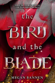
This cover art is as pretty as it is simple. When I think about it, the thing that caught my eye in this cover art is the way the bloodied feathers are arranged. Because it seems as if the most blood is underneath, on the feathers of which we only manage to see the tips. The top feathers have little to no blood on them. That's intriguing, because it makes me think as if the wound that caused so much bleeding is a deep, but a hidden one, something that it's not easy to see. I also like the font used for the title. "Bird" is less shinier than "Blade", and there are flecks of light coming from the lower side of the cover, that don't reach the top part of the title. I find that really, really interesting. This is definitely a book I'll read.
I saw this book on Netgalley and I fell in love with the cover. I've talked about my love of cartoonish and illustrated covers before, but this cover art is among the best illustrated ones I've seen so far. I love the warm tones, the pinks, browns and reds mixed up with some yellows and with the occasional green elements. I love the look on the character's face. That is one mischievous look, y'all. I love how the character has a hand held out, kind of like reaching out for the reader. I wonder how much trouble this character might get into, as well as how the story will play with readers' hearts.
The Spell Speakers by Day Leitao
There are so many gorgeous details in this cover, I have a hard time choosing where to start. I've always been really obsessed with lanterns, especially those vintage looking ones, so the one in this book is absolutely gorgeous. I also love how it seems to be that the lantern and the butterflies inside it are the focus of this photo. I also love the multitude of small lights, which I want to think of as fireflies, that surround the lantern. There's something mystical about this cover, and the only thing that makes it even a little bit scary is the association between the cover and the title. When adding the title, the cover becomes less "fairy tale"-like, and more mysterious and scary. Because I realize that those butterflies are trapped inside the lantern, at night, with nothing to defend them. I'm super curious about the story right now, to be honest.
Dark Secrets by Angela M. Hudson

This cover art is as pretty as it is simple. When I think about it, the thing that caught my eye in this cover art is the way the bloodied feathers are arranged. Because it seems as if the most blood is underneath, on the feathers of which we only manage to see the tips. The top feathers have little to no blood on them. That's intriguing, because it makes me think as if the wound that caused so much bleeding is a deep, but a hidden one, something that it's not easy to see. I also like the font used for the title. "Bird" is less shinier than "Blade", and there are flecks of light coming from the lower side of the cover, that don't reach the top part of the title. I find that really, really interesting. This is definitely a book I'll read.
I saw this book on Netgalley and I fell in love with the cover. I've talked about my love of cartoonish and illustrated covers before, but this cover art is among the best illustrated ones I've seen so far. I love the warm tones, the pinks, browns and reds mixed up with some yellows and with the occasional green elements. I love the look on the character's face. That is one mischievous look, y'all. I love how the character has a hand held out, kind of like reaching out for the reader. I wonder how much trouble this character might get into, as well as how the story will play with readers' hearts.
The Spell Speakers by Day Leitao


