Showing posts with label OWC. Show all posts

Monday, April 16, 2018

Obsessed With Covers #47: Dark Secrets, The Bird and the Blade, The Spell Speakers

Y'all know how much I love a pretty cover. I think about...40% of the books that end up on my shelves (be they physical or digital) do so because of the covers. Call me shallow but you have to admit that a pretty, shiny cover will catch your eye faster than a dull, boring one. Two, simple rules that I'll follow:


  • 1, 2 or 3 (no more than 3, though) covers per week;
  • books should be new-ish; no more than 2 years old.
Oh, before I share the covers that made me drool or want to stare at them for hours and hours, I have to say something. This is a semi-original idea. Why semi? Because almost every book blogger has something similar. The only thing I came up with was the title. If by any chance there's another blogger with a similar feature with the same title, I assure you I'm not stealing your idea. I'm just THAT bad with titles. Believe me, I'd love to be smarter and have a witty name for this feature, but I don't. So, no copyright infringement/theft/steal or anything of the sort was desired. All I can say is sorry :P


So, here are the prettiest covers I've seen this week.

There are so many gorgeous details in this cover, I have a hard time choosing where to start. I've always been really obsessed with lanterns, especially those vintage looking ones, so the one in this book is absolutely gorgeous. I also love how it seems to be that the lantern and the butterflies inside it are the focus of this photo. I also love the multitude of small lights, which I want to think of as fireflies, that surround the lantern. There's something mystical about this cover, and the only thing that makes it even a little bit scary is the association between the cover and the title. When adding the title, the cover becomes less "fairy tale"-like, and more mysterious and scary. Because I realize that those butterflies are trapped inside the lantern, at night, with nothing to defend them. I'm super curious about the story right now, to be honest.

Dark Secrets by Angela M. Hudson


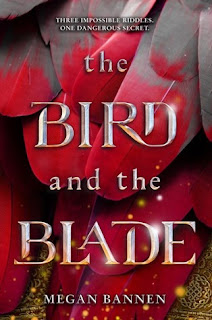
This cover art is as pretty as it is simple. When I think about it, the thing that caught my eye in this cover art is the way the bloodied feathers are arranged. Because it seems as if the most blood is underneath, on the feathers of which we only manage to see the tips. The top feathers have little to no blood on them. That's intriguing, because it makes me think as if the wound that caused so much bleeding is a deep, but a hidden one, something that it's not easy to see. I also like the font used for the title. "Bird" is less shinier than "Blade", and there are flecks of light coming from the lower side of the cover, that don't reach the top part of the title. I find that really, really interesting. This is definitely a book I'll read.


I saw this book on Netgalley and I fell in love with the cover. I've talked about my love of cartoonish and illustrated covers before, but this cover art is among the best illustrated ones I've seen so far. I love the warm tones, the pinks, browns and reds mixed up with some yellows and with the occasional green elements. I love the look on the character's face. That is one mischievous look, y'all. I love how the character has a hand held out, kind of like reaching out for the reader. I wonder how much trouble this character might get into, as well as how the story will play with readers' hearts.


The Spell Speakers by Day Leitao

Monday, March 19, 2018

Obsessed With Covers #46: Twice Dead, Give The Dark My Love

Y'all know how much I love a pretty cover. I think about...40% of the books that end up on my shelves (be they physical or digital) do so because of the covers. Call me shallow but you have to admit that a pretty, shiny cover will catch your eye faster than a dull, boring one. Two, simple rules that I'll follow:


  • 1, 2 or 3 (no more than 3, though) covers per week;
  • books should be new-ish; no more than 2 years old.
Oh, before I share the covers that made me drool or want to stare at them for hours and hours, I have to say something. This is a semi-original idea. Why semi? Because almost every book blogger has something similar. The only thing I came up with was the title. If by any chance there's another blogger with a similar feature with the same title, I assure you I'm not stealing your idea. I'm just THAT bad with titles. Believe me, I'd love to be smarter and have a witty name for this feature, but I don't. So, no copyright infringement/theft/steal or anything of the sort was desired. All I can say is sorry :P


So, here are the prettiest covers I've seen this week.

I adore this cover so, so much! The starry background is pretty enough to make me fall in love with it, but ghostly figure, the almost touching hands and the foggy image of the city at night, overlooking the water are all amazing details. The fog isn't typical, instead it gives the sensation of movement, and one of the hands seems to be almost transparent. I also love the font used for the title. The font kind of makes me thing of old, medieval books. I can almost imagine seeing intricate drawings surrounding the letters. I am definitely curious about why we're seeing the city at night. And why only certain windows and buildings are illuminated. It definitely seems a bit creepy, the way shadow and light are playing on the buildings. I need to know more about this book.

Twice Dead - Caitlin Seal


38910019

There is something appealing about this cover. Blue seems to be the main color in this cover art, with its various shades, and with the occasional black, white, yellow and green specks here and there. I am intrigued by how much light there seems to be in this cover, coming from the window and the lantern the young woman is holding, which seems to be in contradiction with the title. Or is it? I wonder if the young woman is saying goodbye to "the Dark", or if she's sending a warning under the guise of a declaration of love. She definitely seems to be surrounded by shadows, and the sea storm that we can glimpse out the window is definitely telling me that maybe this woman has something dark about her. I am very intrigued by this cover and I definitely want to read it.


Monday, February 12, 2018

Obsessed With Covers #45: Forge Of Darkness, Contagion

Y'all know how much I love a pretty cover. I think about...40% of the books that end up on my shelves (be they physical or digital) do so because of the covers. Call me shallow but you have to admit that a pretty, shiny cover will catch your eye faster than a dull, boring one. Two, simple rules that I'll follow:


  • 1, 2 or 3 (no more than 3, though) covers per week;
  • books should be new-ish; no more than 2 years old.
Oh, before I share the covers that made me drool or want to stare at them for hours and hours, I have to say something. This is a semi-original idea. Why semi? Because almost every book blogger has something similar. The only thing I came up with was the title. If by any chance there's another blogger with a similar feature with the same title, I assure you I'm not stealing your idea. I'm just THAT bad with titles. Believe me, I'd love to be smarter and have a witty name for this feature, but I don't. So, no copyright infringement/theft/steal or anything of the sort was desired. All I can say is sorry :P


So, here are the prettiest covers I've seen this week.

Monday, December 18, 2017

Obsessed With Covers #44: Onyx & Ivory, Sea Witch

Y'all know how much I love a pretty cover. I think about...40% of the books that end up on my shelves (be they physical or digital) do so because of the covers. Call me shallow but you have to admit that a pretty, shiny cover will catch your eye faster than a dull, boring one. Two, simple rules that I'll follow:


  • 1, 2 or 3 (no more than 3, though) covers per week;
  • books should be new-ish; no more than 2 years old.
Oh, before I share the covers that made me drool or want to stare at them for hours and hours, I have to say something. This is a semi-original idea. Why semi? Because almost every book blogger has something similar. The only thing I came up with was the title. If by any chance there's another blogger with a similar feature with the same title, I assure you I'm not stealing your idea. I'm just THAT bad with titles. Believe me, I'd love to be smarter and have a witty name for this feature, but I don't. So, no copyright infringement/theft/steal or anything of the sort was desired. All I can say is sorry :P


So, here are the prettiest covers I've seen this week.

Monday, November 13, 2017

Obsessed With Covers #43: The Unbinding of Mary Reade, Ash Princess, Sky In The Deep

Y'all know how much I love a pretty cover. I think about...40% of the books that end up on my shelves (be they physical or digital) do so because of the covers. Call me shallow but you have to admit that a pretty, shiny cover will catch your eye faster than a dull, boring one. Two, simple rules that I'll follow:


  • 1, 2 or 3 (no more than 3, though) covers per week;
  • books should be new-ish; no more than 2 years old.
Oh, before I share the covers that made me drool or want to stare at them for hours and hours, I have to say something. This is a semi-original idea. Why semi? Because almost every book blogger has something similar. The only thing I came up with was the title. If by any chance there's another blogger with a similar feature with the same title, I assure you I'm not stealing your idea. I'm just THAT bad with titles. Believe me, I'd love to be smarter and have a witty name for this feature, but I don't. So, no copyright infringement/theft/steal or anything of the sort was desired. All I can say is sorry :P


So, here are the prettiest covers I've seen this week.


I saw this cover last week and I fell in love. I love sailing ships. I have a thing for them. And any drawing/painting/photograph with a ship in it will catch my eye. What I love most about this cover is that it seems as if the ship is caught in the middle of a storm. Which is kind of fitting for the story itself, at least based on the blurb. I like the colors used for the background, and the fog around the ship. It kind of makes me think that the fate of that ship is hanging on by a thread, that the fog is threatening the ship somewhat more than the storm. There's also a kind of shadow underneath the ship, a weird shape, and I want to know what that is about.

I also like the font used for the title. It kind of looks like it's coming out of the sails, and I love that. I love the cover and I'd love to see it in hardback version.

The Unbinding of Mary Reade by Miriam McNamara

 Aside from ships, I have a thing for fiery designs. This cover is simple and yet it holds a world of tiny details in it. The crown looks like a metal/iron crown that was burned down, and I can see some random designs in the smoke/embers around the bottom part of the crown. I see what looks like wings in the middle, some flowers, maybe some feathers... There's a lot happening with that crown. I also like how the crown seems to be crumbling, the ash slowly falling off and disintegrating on the title. Another really cool thing is that the background is really simple.

I want to know what those designs in the crown mean, and if in any way, shape or form they appear in the story itself.


This might be my favorite cover that I've seen lately that has a cover model. The model reminds me of Lagertha. I love that we can't really see her, it makes her more dangerous and more badass, which I love! But at the same time I wonder why exactly half of her face is hidden. What is she hiding? I also love the design on the blade of the axe. I love the feel of the entire cover, and I really, really want to see it in real life. I wonder what designs would there be under the dust jacket of a HB version of the book.


Sky In The Deep by Adrienne Young


What about you? What are some of the more recent covers you've fell in love with?

Monday, September 11, 2017

Obsessed With Covers #42: Coming Home To Island House, Summer At Coastguard Cottages, Christmas At The Dancing Duck

Y'all know how much I love a pretty cover. I think about...40% of the books that end up on my shelves (be they physical or digital) do so because of the covers. Call me shallow but you have to admit that a pretty, shiny cover will catch your eye faster than a dull, boring one. Two, simple rules that I'll follow:


  • 1, 2 or 3 (no more than 3, though) covers per week;
  • books should be new-ish; no more than 2 years old.
Oh, before I share the covers that made me drool or want to stare at them for hours and hours, I have to say something. This is a semi-original idea. Why semi? Because almost every book blogger has something similar. The only thing I came up with was the title. If by any chance there's another blogger with a similar feature with the same title, I assure you I'm not stealing your idea. I'm just THAT bad with titles. Believe me, I'd love to be smarter and have a witty name for this feature, but I don't. So, no copyright infringement/theft/steal or anything of the sort was desired. All I can say is sorry :P


This week's Obsessed With Covers post will be all about vector art. You might not know this about me, but for a while there I dabbled into making really rudimentary, slightly bad-looking vector illustrations, which gave me an appreciation for really beautiful illustrations. Add to that the fact that I've always loved cartoonish/illustrated cover art, so it's no wonder my OWC posts will include this type of covers. So, without further ado, here are the prettiest covers I've seen this week.

This is such a pretty cover. I love the tiny details on the lake, just like I love the wisteria on the edges. Actually the wisteria gives the illustration the air of mystery, like you have to search for this island house somewhere in a place where you wouldn't normally find a house. I also adore the vintage car coming up on the driveway. I love vintage cars, and it makes sense that that's the car that should have been used for this illustration. I feel like any other model would have been out of place with the feel of the illustration. I am curious if there are two people in that car or if my eyesight is really that bad, and if there are two people, I wonder which one is doing the "coming home" part.


Coming Home To Island House - Erica James


This cover art makes me think of a little beach resort, that opens just for the summer season. Yes, I know, that kind of sounds very similar to the Kellerman's resort from Dirty Dancing, but can you blame me? It's the perfect summer vacation that I can think of. I love that most vector illustrated covers have some form of design on the edges, be it flowers or whatever, and it gives them this air of... how do I put it? Like the rest of the picture is hidden away, like a little corner of the world where no bad things can happen, and the people in that corner are protected from the outside world. That's what this image makes me think of. Also, those little birds flying just over the water add a sense of movement to the entire illustration. I can just imagine hearing the waves crashing on the shores, the birds singing and the smell of sea in the air. I now want for summer to come back, as well as to read this book ASAP.


Christmas themed books are starting to appear and I couldn't be happier, because that means pretty Christmas illustrations too. I love the ribbon used as a background for the author's name, I love the decorated trees, the snowflakes, the people playing in the snow, basically I love this cover. I also love the tagline, "A perfectly festive romantic read", as I feel that this is the perfect illustration for a Christmas postcard. I'm very curious if this pub, The Dancing Duck, is like any other character in the book, if somehow the pub is not only the location, but somehow much more important than simply offering the perfect setting from a winter romance.


Christmas At The Dancing Duck - Daisy James


What about you, fellow bookworms? Did you find any pretty covers lately?

Monday, August 14, 2017

Obsessed With Covers #41: Children Of Blood And Bone, Winter Glass, The Wicked Deep

Y'all know how much I love a pretty cover. I think about...40% of the books that end up on my shelves (be they physical or digital) do so because of the covers. Call me shallow but you have to admit that a pretty, shiny cover will catch your eye faster than a dull, boring one. Two, simple rules that I'll follow:


  • 1, 2 or 3 (no more than 3, though) covers per week;
  • books should be new-ish; no more than 2 years old.
Oh, before I share the covers that made me drool or want to stare at them for hours and hours, I have to say something. This is a semi-original idea. Why semi? Because almost every book blogger has something similar. The only thing I came up with was the title. If by any chance there's another blogger with a similar feature with the same title, I assure you I'm not stealing your idea. I'm just THAT bad with titles. Believe me, I'd love to be smarter and have a witty name for this feature, but I don't. So, no copyright infringement/theft/steal or anything of the sort was desired. All I can say is sorry :P


So, here are the prettiest covers I've seen this week.

I adore this cover. Ever since I saw it I was in love with it, to be honest. What's not to love? The hair is my ultimate favorite hair color and if I could pull it off, I'd give up being a redhead in a heartbeat. I love how the hair is made to look like flames or like it's floating in water or something. There's something going on with that hair and I want to know what!

Then there's the model herself/himself. The markings/drawing on the model's skin are very interesting and I wonder what they represent. I'm sure it has some meaning and I wonder what it is and if we'll find out about it. The eyes are gorgeous and they seem to be looking straight at you, which is scary and awesome at the same time.

I can't wait to get my hands on this book.

Children of Blood And Bone by Tomi Adeyemi


If the first cover in this series was gorgeous, this one is even more so. I love how Sleeping Beauty's castle is frozen here. I love the shields and the spears, they look like they're protecting the castle. And that squirrel is so cute!! I also see what seems to be Cinderella's glass shoe hanging from the title, so I wonder how that plays out. Basically the entire cover is made of awesome!


This cover looks hand-drawn and it is simply gorgeous. The thing about it is it makes it look like a really scary book, probably due to looking like a drawing. A really good drawing, mind you! I really want to know the meaning of the cover and how it ties into the story. And I really want to see more of the cover artist's work. It reminds me of Ruthie's instagram (who if you're not following GO NOW AND FOLLOW HER BECAUSE SHE'S AMAZING!!!).


The Wicked Deep by Shea Ernshaw


That's it for today, guys! Tell me which covers you've recently seen that are gorgeous.

Monday, August 7, 2017

Obsessed With Covers #40: Everless, Heart of Iron, Ultraxenopia

Y'all know how much I love a pretty cover. I think about...40% of the books that end up on my shelves (be they physical or digital) do so because of the covers. Call me shallow but you have to admit that a pretty, shiny cover will catch your eye faster than a dull, boring one. Two, simple rules that I'll follow:


  • 1, 2 or 3 (no more than 3, though) covers per week;
  • books should be new-ish; no more than 2 years old.
Oh, before I share the covers that made me drool or want to stare at them for hours and hours, I have to say something. This is a semi-original idea. Why semi? Because almost every book blogger has something similar. The only thing I came up with was the title. If by any chance there's another blogger with a similar feature with the same title, I assure you I'm not stealing your idea. I'm just THAT bad with titles. Believe me, I'd love to be smarter and have a witty name for this feature, but I don't. So, no copyright infringement/theft/steal or anything of the sort was desired. All I can say is sorry :P


It's been a while since I last did one of these posts, and during this time I managed to find some pretty awesome covers that I just wish I had enough money to buy each and every one of these books if only just for how pretty they are.

Here are some of the most gorgeous covers I've seen lately:

There's a scene in Aladdin at the beginning, where Jafar looks into an hourglass and the sand transforms to show Aladdin doing...whatever he was doing. That's what I saw when I first saw this cover, that the hourglass is much like a crystal ball for someone with very nefarious purposes. I don't know if that's the case, but whomever the cover artist is, they did a damn fine job with this cover. From the sand itself, to the metal/silver embellishments on the hourglass, to the title, to the background, this cover is meant to draw your eye, and it does that perfectly. The only thing that would make it even better is if some of the details were embossed in some way. Or if there was a double cover, like the old romance books, were you get to see the rest of the image hiding behind the hourglass frame


Everless by Sara Holland


I can't help but imagine a giant space water lily when I look at this cover. A water lily made of reinforced glass and metal, with satellites and oxygen tanks. I imagine that the "heart" in question is this flower-shaped spaceship, so I'm curious what is so special about it. I honestly love this cover and I'm super curious to see exactly how the cover relates to the story.

The galaxy in the background is also gorgeous, and I like that it somehow makes the spaceship even prettier. I wonder if those are really satellites or if they're enemy spacecrafts, trying to destroy the "heart". 


This is where my mad scientist self is doing a happy dance, because that cover makes me think "mad scientist decides to play god, make up a world and then destroy it just for fun". I love the contrast between the fire in the Erlenmeyer flask and the white bird (dove??) that is created by the smoke. Kind of like "there's still hope, even when everything goes to hell" kind of thing. I'm really, really intrigued just by looking at the cover, and I am planning on checking out the book, to see if in any way my inner mad scientist was right about the cover or if she needs to be leashed a little bit more *mad laughter* Ehem....*clears throat*


Ultraxenopia by M.A. Phipps


What about you, my lovelies? Any great, gorgeous covers that drew your eye and tickled your imagination lately?

Monday, February 20, 2017

Obsessed With Covers #39: The Valiant, Ash and Quill, Traitor To The Throne

Y'all know how much I love a pretty cover. I think about...40% of the books that end up on my shelves (be they physical or digital) do so because of the covers. Call me shallow but you have to admit that a pretty, shiny cover will catch your eye faster than a dull, boring one. Two, simple rules that I'll follow:


  • 1, 2 or 3 (no more than 3, though) covers per week;
  • books should be new-ish; no more than 2 years old.
Oh, before I share the covers that made me drool or want to stare at them for hours and hours, I have to say something. This is a semi-original idea. Why semi? Because almost every book blogger has something similar. The only thing I came up with was the title. If by any chance there's another blogger with a similar feature with the same title, I assure you I'm not stealing your idea. I'm just THAT bad with titles. Believe me, I'd love to be smarter and have a witty name for this feature, but I don't. So, no copyright infringement/theft/steal or anything of the sort was desired. All I can say is sorry :P

Photobucket

Hey there everyone! Before I share some new-ish, cool, pretty covers, I have a question for you. In your honest opinion, is there such a thing as "cover-lust slump"? Like can you get tired of pretty covers? Not tired, maybe tired is the wrong word. Indifferent? I've had this... thing over the past few weeks, where I just didn't notice pretty covers anymore. Sure, I notice them, but it takes a while for me to notice them, and I wonder why. I wonder if this is in any way related to bookstagram. Because my feed is constantly full of pretty covers, and I wonder if somehow that makes me immune to noticing them, as opposed to before, when I didn't get to see those pretty, gorgeous cover arts every day, therefore making them more noticeable. Am I just weird or is this a thing you noticed? 

Anyway, moving on to the pretty covers.

I grew up in the 90s, which, in case you're wondering, means tons of Xena, The Warrior Princess marathons. So there's no way for me to think of anything other than Xena when looking at this cover. Based only on the blurb, Fallon makes me thing of a mashup between young, villanous Xena and innocent Gabrielle, with a sprinkling of whichever amazon warrior was your favorite from that show. I'm really excited for this book, and I have to say, my expectations are super high. I also like how the model seems so in control and badass, and so threatening, even though her sword is on the ground, and she has just what looks like a knife or a tiny sword to fight with, and no shield, no other weapons, not even proper armor. I would have wanted for her to not have that model-ish pose with her feet, but the cover is still amazing. And I love the crowd in the background, they look so still, they look like they're either turned to stone, or they're just waiting for something great to happen.


Each new cover added to The Great Library series is amazing, but this one might be my favorite one. I love how tragic it looks, how gloomy it all seems based on just this cover art. It kinda makes me feel like not only is The Great Library, and the entire Library system at risk, but also the lives of Jess and his friends. I still have to read the second book, but I am intrigued to see what happens now with the characters, as well as with the Library. 


My first ever adventure video game I ever played, again back in the 90s, with the 2D graphics and strange music, was Prince Of Persia. I still can't remember how to make those high jumps and keep from falling into the swords, but that's another story. That's what I think of when I see this cover. A female version of that game, and I would have wanted to have that growing up. I adore this cover, to be honest. I know I was in love with the original cover art for the first book in the series, but the new cover art is even more gorgeous. There's something so incredible about it, between the colors, the movement, the model, the little embellishment underneath the title, everything. It's kind of like a still from a movie, and I desperately want to watch/read that movie. 


What about you? Did you see any covers that caught your eyes lately? What about my weird introduction to this post? Do you think there's such a thing as "cover-lust slump"?

Monday, October 31, 2016

Obsessed With Covers #38: Dividing Eden, Shadow Run, House Of Furies

Y'all know how much I love a pretty cover. I think about...40% of the books that end up on my shelves (be they physical or digital) do so because of the covers. Call me shallow but you have to admit that a pretty, shiny cover will catch your eye faster than a dull, boring one. Two, simple rules that I'll follow:


  • 1, 2 or 3 (no more than 3, though) covers per week;
  • books should be new-ish; no more than 2 years old.
Oh, before I share the covers that made me drool or want to stare at them for hours and hours, I have to say something. This is a semi-original idea. Why semi? Because almost every book blogger has something similar. The only thing I came up with was the title. If by any chance there's another blogger with a similar feature with the same title, I assure you I'm not stealing your idea. I'm just THAT bad with titles. Believe me, I'd love to be smarter and have a witty name for this feature, but I don't. So, no copyright infringement/theft/steal or anything of the sort was desired. All I can say is sorry :P

Photobucket

Hey there guys! It's been so long since my last OWC post. I've been in a funk lately with this feature for some reason, probably because I haven't searched for new books/covers. I've been flooded with work and I've only had enough free time to write reviews and read books. But since I have some free days from work coming up, I'm planning on catching up on my reviews and feature posts. Anyway, here are some of the prettiest covers I've seen this week.

There's something so creepy and evil about this cover art! Ever since I was a little girl I thought black and white together made for a very scary combo. I blame Cruella, because she scared the crap out of me. Even so, I think there's something insanely elegant about the combo, and mysterious. I can't help but think that the inky substance on the chair is kind of like that thing that happened to Scarlett Johansson in Lucy. So I'm so curious to know what it is, and how exactly will it "divide Eden". Also, Eden makes me think about the Garden of Eden, so I'm curious if there's any relation to that. Plus, the blurb is amazing.


Dividing Eden - Joelle Charbonneau 


One of my favorite things to do growing up was play video games. It was actually a mother-daughter activity, believe it of not, with Mom being just as in love with these games as I was. So when I saw this cover on Netgalley I remembered of the good ol' days. I can just hear the background music, getting my heart to beat faster, preparing me for when those doors open and the baddies start flooding the room. It reminds me of the game Quake II. Man, if only I had my old computer. Anyway, I am desperately curious to see what this book is about, especially since the blurb mentions it's kind of a mash-up of Firefly and Dune, so even more awesome.


Based only on the cover, this book makes me thing serial killer hiding in a nightmare-version of the hall of Hogwarts. It's the color! And the tagline, which I think it's brilliant. "They come here to die". Kind of like a twisted version of Hotel California. Now that I think about it, it does remind me a little of the Eagle's famous song. Even with the blurb. Ooooh, now I need this book in my life even more.


House of Furies - Madeleine Roux

Monday, July 4, 2016

Obsessed With Covers #37: Starfall, Spindle Fire

Y'all know how much I love a pretty cover. I think about...40% of the books that end up on my shelves (be they physical or digital) do so because of the covers. Call me shallow but you have to admit that a pretty, shiny cover will catch your eye faster than a dull, boring one. Two, simple rules that I'll follow:


  • 1, 2 or 3 (no more than 3, though) covers per week;
  • books should be new-ish; no more than 2 years old.
Oh, before I share the covers that made me drool or want to stare at them for hours and hours, I have to say something. This is a semi-original idea. Why semi? Because almost every book blogger has something similar. The only thing I came up with was the title. If by any chance there's another blogger with a similar feature with the same title, I assure you I'm not stealing your idea. I'm just THAT bad with titles. Believe me, I'd love to be smarter and have a witty name for this feature, but I don't. So, no copyright infringement/theft/steal or anything of the sort was desired. All I can say is sorry :P

Photobucket

So, here are the prettiest covers I've seen this week.

This cover reminds me of the very, very old Windows 98-ish screensaver, with the stars that kept moving, making it seem you were travelling through space (yeah, I'm THAT old, that I remember using that Windows!). But I love that. It makes the "falling" that the title speaks of seem more imminent, more real. I love the glow of the planet. The entire cover seems to actually concentrate around the planet. It makes me wonder if the planet somehow makes everything close to it crash on its surface. Even the title seems to resemble one of Saturn's rings. If the cover for the first book in the series is pretty, this one is gorgeous and I definitely want to get my hands on both of them soon.


Starfall - Melissa Landers


I already admitted to this in a previous post, but I have a soft spot for Maleficent's raven. So that was the first thing I noticed. And then I noticed some other details as well, that made me very curious. The cover makes me believe there are two equally important stories that the reader should focus on. It also makes me think that if one story ends in tragedy, the other one will as well. I read the blurb and I'm curious about the idea of two princesses. I am so curious to see how their story ends, but I do believe there's a lot of heartbreak along the way. I also love the tagline. It's brilliant and I can't wait to get my hands on this book.


Spindle Fire - Lexa Hillyer


Monday, June 6, 2016

Obsessed With Covers #36: Wayfarer, As Old As Time, Frost Blood

Y'all know how much I love a pretty cover. I think about...40% of the books that end up on my shelves (be they physical or digital) do so because of the covers. Call me shallow but you have to admit that a pretty, shiny cover will catch your eye faster than a dull, boring one. Two, simple rules that I'll follow:


  • 1, 2 or 3 (no more than 3, though) covers per week;
  • books should be new-ish; no more than 2 years old.
Oh, before I share the covers that made me drool or want to stare at them for hours and hours, I have to say something. This is a semi-original idea. Why semi? Because almost every book blogger has something similar. The only thing I came up with was the title. If by any chance there's another blogger with a similar feature with the same title, I assure you I'm not stealing your idea. I'm just THAT bad with titles. Believe me, I'd love to be smarter and have a witty name for this feature, but I don't. So, no copyright infringement/theft/steal or anything of the sort was desired. All I can say is sorry :P

Photobucket

So, here are the prettiest covers I've seen this week.

If I loved the cover for the first book in the series, I completely adore the art for the second one. I love that the cover artist made the background a little bit darker, making it seem as if the characters will go through something really dramatic in this book. I also like the change in the art itself. If the cover for Passenger featured the image of a "captive" town, this time it seems as if the town, as well as its inhabitants, are free, while the people living in what looks like a rural, old setting, are being hold prisoners by something. I love that birds broke the glass, making it seem that there is some silver lining, but the image makes me think the road is long, and full of battles. I definitely need to read the first book, because just the cover arts are making me insanely curious about the story.


Wayfarer - Alexandra Bracken


I'm going to be completely honest with you and say I have a love-hate relationship with this cover. I love it, because makes me think that this is going to be a heartbreaking story. The fact that the rose looks so frail and that the Beast is barely just a shadow, while his castle looks like it's about to catch on fire, makes me think that him and Belle will barely make it out of their "twisted tale". At the same time though, I hate that the editor/publisher/the-powers-that-be decided to change the cover art style. Remember how the first two books featured the princesses' profiles? I understand that in this book Beast is probably the main focus, but they could have made the same style of cover art, showing his profile. I did notice there's an alternate cover art for the first book in the series, in the same style as this one, so maybe they gave up to the first art style. Meh. I'm still curious about this book though.

As Old As Time - Liz Braswell


While much simpler than the covers I usually like, this last cover is just gorgeous. I like the difference between the ice and the blood, I like how it makes it seem as if it takes a lot for red blood to flow, like it has to be a super powerful weapon to make a person with "regular" blood to bleed out. It makes me wonder what's so special about that icicle, and what it actually represents in the story. I also love the icy background. It's as if the ice is way more powerful than normal blood, which makes me even more curious about the book. I hope the letters from the title are embossed in some way, or that there's some sort of special effects for the final cover, because that would be so awesome.


Frost Blood - Elly Blake

Monday, May 16, 2016

Obsessed With Covers #35: The Kingdom of Little Wounds, Carve The Mark, The Many Lives of John Stone

Y'all know how much I love a pretty cover. I think about...40% of the books that end up on my shelves (be they physical or digital) do so because of the covers. Call me shallow but you have to admit that a pretty, shiny cover will catch your eye faster than a dull, boring one. Two, simple rules that I'll follow:


  • 1, 2 or 3 (no more than 3, though) covers per week;
  • books should be new-ish; no more than 2 years old.
Oh, before I share the covers that made me drool or want to stare at them for hours and hours, I have to say something. This is a semi-original idea. Why semi? Because almost every book blogger has something similar. The only thing I came up with was the title. If by any chance there's another blogger with a similar feature with the same title, I assure you I'm not stealing your idea. I'm just THAT bad with titles. Believe me, I'd love to be smarter and have a witty name for this feature, but I don't. So, no copyright infringement/theft/steal or anything of the sort was desired. All I can say is sorry :P

Photobucket

So, here are the prettiest covers I've seen this week.


This cover looks like a photo inside a photo. It's easy to notice the castle and the beautifully colored sky first, or at least it was for me. But then I looked at the frame and OMG so many things to see there, so many creatures, so many hidden details that make me wonder if those aren't part of those "Little Wounds". Also, I had the chance to see this book IRL and let me tell you, it is just as stunning, if not more.


The Kingdom of Little Wounds - Susann Cokal


I have to say, this cover is absolutely gorgeous. I would love to have this book in my shelves, it's so pretty. I'm actually expecting the finished copy to have some nice effect, like maybe the gold liquid that bleeds through those cuts to shimmer or something similar. I can't help but wonder what the title and cover have to do with the actual story though. Because the cover does not lead me to think "Dystopia", and yet that's how the book is shelved as on Goodreads. All of that said, I kinda see some stars in there, so maybe that's a wall that's carved into? I am now very curious about the book.


Carve The Mark - Veronica Roth


There are so many things going on in this cover, I don't even know where to start. I love how the mirror is broken and how it shows different portraits of what seems to be different people. I also love how there seem to be shards missing, which makes me wonder what happened to them? The fact that the background is black though makes me think that maybe that's not a mirror. The camera that the girl is holding makes me wonder if that's not actually a broken lens? There are some strange symbols reflected in one of the shards and that also make me wonder about the story, and also there's an incomplete image there, with the shard that's nearest to the colored reflection of the guy. I could go on and on, but basically I am obsessed with this cover. A lot!


The Many Lives of John Stone - Linda Buckley-Archer

Monday, April 25, 2016

Obsessed With Covers #34: The Keeper Of The Mist, Empire OF Dust, The Otherlife

Y'all know how much I love a pretty cover. I think about...40% of the books that end up on my shelves (be they physical or digital) do so because of the covers. Call me shallow but you have to admit that a pretty, shiny cover will catch your eye faster than a dull, boring one. Two, simple rules that I'll follow:


  • 1, 2 or 3 (no more than 3, though) covers per week;
  • books should be new-ish; no more than 2 years old.
Oh, before I share the covers that made me drool or want to stare at them for hours and hours, I have to say something. This is a semi-original idea. Why semi? Because almost every book blogger has something similar. The only thing I came up with was the title. If by any chance there's another blogger with a similar feature with the same title, I assure you I'm not stealing your idea. I'm just THAT bad with titles. Believe me, I'd love to be smarter and have a witty name for this feature, but I don't. So, no copyright infringement/theft/steal or anything of the sort was desired. All I can say is sorry :P

Photobucket

It's been a while since I shared my recently cover loves, which is mainly because I've been in a huge blogging slump. I'm back on track though, guys! Here are some of my favorite covers for last week.


How gorgeous is this cover? I love that the background is grey and that the "mist" is colored, while also coloring the elements in the background as it advances and as it touches stuff. That must be some really powerful magic that the person is having and/or controlling. I also love that the mist is concentrating on either entering or enveloping what looks like a stopwatch. I wonder why that is. Also, I want to know the importance of the key and the calligraphy pen. Okay, so I will probably have to read this based only on the cover.


The Keeper Of The Mist - Rachel Neumeier


There's something hauntingly beautiful about this cover. Because, while the three Pyramids are reflected in the mirror of the key, in vivid colors, the key itself seems to be surrounded by snow. At least it looks like snow to me, it might be white sand, but I want to believe it's snow. And that makes me wonder why. Even if it is just really white sand, why is it that the scenery with the pyramids is so warm, and full of color, while the background is so...cold? I read the blurb, so I know it's about Alexander the Great, which makes my inner history nerd bounce around excitedly. I think this book will also end up in my TBR mountain.


Empire Of Dust - Eleanor Herman


I saw this book on Netgalley yesterday while I was browsing idly, just looking at the new books coming out, and it immediately caught my attention. The cover makes me think of darkness and danger, which if you pair it up with the blurb, it makes sense. I love the swirls, the gradient made by the colors used. I also am kind of intrigued on why no other colors were used. I am kind of hoping that there are some embossed elements there in the paperback version, because it just seems like that's what the cover needs


The Otherlife - Julia Gray


What about you? Did you saw any pretty covers lately?

Monday, February 15, 2016

Obsessed With Covers #33: 5 to 1, Rebel of the Sands, Mind Games

Y'all know how much I love a pretty cover. I think about...40% of the books that end up on my shelves (be they physical or digital) do so because of the covers. Call me shallow but you have to admit that a pretty, shiny cover will catch your eye faster than a dull, boring one. Two, simple rules that I'll follow:


  • 1, 2 or 3 (no more than 3, though) covers per week;
  • books should be new-ish; no more than 2 years old.
Oh, before I share the covers that made me drool or want to stare at them for hours and hours, I have to say something. This is a semi-original idea. Why semi? Because almost every book blogger has something similar. The only thing I came up with was the title. If by any chance there's another blogger with a similar feature with the same title, I assure you I'm not stealing your idea. I'm just THAT bad with titles. Believe me, I'd love to be smarter and have a witty name for this feature, but I don't. So, no copyright infringement/theft/steal or anything of the sort was desired. All I can say is sorry :P

Photobucket

This week's edition of Obsessed With Covers is inspired by Zentangle. I recently discovered the pleasures of Zentangle and of making something out of my random doodles and these covers are way too pretty not to resemble some of the best doodle art I've seen so far.


I've always been fascinated by the art of henna tattoos. They look absolutely gorgeous and I always get curious to know if the designs mean anything, either spiritually or just if they have a hidden meaning for each person that wears them. It's no wonder that the cover of 5 to 1 caught my eye. Just looking at the cover, however, I don't really get a sense of what the connection between the cover art and the title is. I did read the blurb, so that helped me understand that connection a bit more. I also love the different colors used to make the drawings pop.


5 to 1 - Holly Bodger


That's a lion, right? I'm not the only one who sees it, right? Having recently watched Aladdin, it is very easy for me to make the connection between the cover art and the entrance to the Cave of Wonders from the movie. And that is such a cool thing, because it makes me instantly interested in reading the story. I love how the mane was drawn. I love how the rider is so small, making it seem like the viewer shouldn't see him, like he (or is it she?) should've managed to get out of the frame unseen, undetected. I also love the sand dune and the sand lines overlapping most of the photo, almost as much as I love the silhouette of the palace.


Rebel of the Sands - Alwyn Hamilton


I love how simple this cover is, and yet it really makes the title make sense. I really like the placement of the words. It's almost as if the mind games refer to what you see, not what you think. Does that make sense? That's the idea that I get from the cover. I am very curious about this book, based only on the cover. I wish the paperback version were embossed, though. I feel like that would be such a cool thing, for the cover to be embossed. Or maybe the background is matte? All I know is that I can't wait to get out of my book buying ban to get my hands on this pretty :D


Mind Games - Teri Terry
Related Posts Plugin for WordPress, Blogger...